Lesson Introduction
Have you ever encountered a chart or graph so confusing it left you scratching your head? Or maybe you've seen a data visualization that was beautiful, but didn't quite tell the story it seemed to promise.
The culprit behind these communication breakdowns often lies in a missed step: understanding the who. Effective data visualization isn't just about presenting information; it's about presenting it in a way that resonates with a specific audience.
This module dives deep into the world of user research and empathy – the secret weapons for crafting data visualizations that not only look good, but speak directly to the needs of your target audience. We'll explore various user research methods, delve into the power of user personas, and finally, learn how to leverage empathy mapping to design data visualizations that truly connect.
Get ready to step into the shoes of your users and unlock the secrets to creating impactful data stories!
What is User Research?
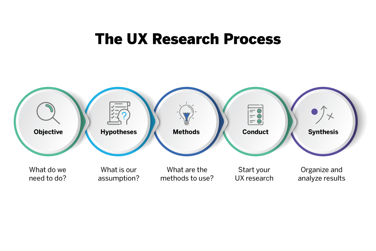
User research is the process of gathering information about your target audience to understand their needs, behaviors, and preferences. It's vital for data visualization because it ensures your visualizations are:
- Relevant: You present data that your audience actually cares about and needs to see.
- Usable: Your visualization is designed in a way that's easy for them to understand and interpret.
- Actionable: The data insights can be used to make informed decisions.
Think of it like giving a presentation: you wouldn't just speak in technical jargon without considering your audience's background knowledge. User research helps you tailor your data visualization for maximum impact.
The Empathy Edge: Why Understanding Users Makes Data Visualization Sing

Data visualizations are like windows into the world of information. But just like a dirty window, a visualization designed without empathy can obscure the very insights it aims to reveal.
Here's where empathy comes in – the ability to see the world through your users' eyes and understand their perspective. In data visualization, empathy is the bridge between the cold logic of numbers and the human desire for clear, meaningful communication.
Why is Empathy Important?
Imagine creating a stunning chart to showcase sales trends, only to discover later that your target audience finds pie charts confusing. Ouch! Empathy helps you avoid these pitfalls by:
- Uncovering Hidden Needs: User research, fueled by empathy, allows you to understand what information your audience truly needs and how they prefer to consume it.
- Tailoring the Message: By understanding user limitations and preferences, you can design visualizations that are clear, concise, and avoid information overload.
- Building Emotional Connection: Effective data visualizations not only inform, but can also evoke emotions that resonate with the audience, making the data story more impactful.
Developing Your Empathy Muscle
The good news is that empathy is a skill you can cultivate. This module will equip you with tools like user personas and empathy mapping to:
- Step into your users' shoes: Imagine their challenges, goals, and emotional responses to data.
- Design with purpose: Craft visualizations that address user needs and guide them towards understanding the data.
- Create human-centered visualizations: Move beyond aesthetics to create visualizations that truly connect with your audience.
By embracing empathy, you'll transform your data visualizations from mere charts and graphs into powerful communication tools that resonate with your audience and leave a lasting impression.
Surveying the Landscape: Quantitative User Research with Surveys

Surveys are a cornerstone of user research, offering a powerful way to gather data from a large pool of potential users. Think of them as efficient tools for casting a wide net and capturing a broad range of perspectives on your data visualization project.
Benefits of Surveys:
- Scalability: Surveys allow you to reach a large number of users in a relatively short timeframe, providing valuable insights into user demographics, preferences, and behaviors.
- Quantifiable Data: Survey responses can be easily quantified and analyzed statistically, providing a clear picture of trends and central tendencies within your target audience.
- Cost-Effectiveness: Compared to in-depth interviews, surveys are a cost-effective method for gathering user research data, especially when using online survey tools.
Types of Surveys and Crafting Effective Questions:
Not all surveys are created equal! Here are some common survey types and how to ensure your questions yield valuable data:
- Multiple Choice: Present users with several answer options to choose from. Ideal for gathering data on user preferences and opinions. (Example: Which type of chart do you find easiest to understand: A) Bar Chart, B) Pie Chart, C) Line Graph)
- Likert Scale: Ask users to rate their level of agreement with a statement on a scale (e.g., Strongly Disagree, Disagree, Neutral, Agree, Strongly Agree). Useful for gauging user attitudes and perceptions. (Example: How comfortable are you interpreting data visualizations on a scale of 1 (Not Comfortable) to 5 (Very Comfortable)?)
- Open-Ended Questions: Encourage users to provide their own, unprompted responses. Great for uncovering deeper insights and unexpected perspectives. (Example: What challenges do you typically encounter when trying to understand data visualizations?)
Remember: Well-constructed questions are key! Keep them clear, concise, and avoid leading language that might bias responses.
Limitations of Surveys:
While powerful, surveys have their limitations:
- Bias: Poorly worded questions or answer choices can introduce bias, skewing your results. Pilot test your survey to identify potential issues.
- Low Response Rates: Getting users to complete a survey can be challenging. Incentives or clear communication about the survey's purpose can help improve response rates.
- Limited Depth: Surveys offer a snapshot, but may not capture the nuances of user behavior and thought processes. Consider combining surveys with other user research methods for a more comprehensive picture.
By understanding the strengths and weaknesses of surveys, you can leverage them effectively to gather valuable quantitative data that informs the design of your data visualization. The insights you gain will help ensure your visualization resonates with a broad audience and effectively communicates its message.
Diving Deeper: Qualitative User Research with Interviews

Surveys provide a broad picture, but interviews offer a deep dive. If you want to truly understand the "why" behind user behavior and delve into their thought processes, interviews are an invaluable user research tool.
The Power of Interviews:
Unlike surveys, interviews allow for rich, in-depth conversations. Here's what makes them so valuable:
- Uncovering Needs and Motivations: Interviews provide a platform for users to elaborate on their needs, challenges, and motivations when interacting with data. This qualitative data paints a vivid picture of the user experience.
- Exploring Thought Processes: Through open-ended questions and follow-up prompts, you can uncover how users think about data, what questions they have, and how they interpret visualizations.
- Building Rapport: Interviews foster a one-on-one connection, allowing you to build rapport with users and gain valuable insights beyond what a survey might capture.
Choosing Your Interview Format:
There's no one-size-fits-all interview format. The best approach depends on your research goals:
- Structured Interviews: These follow a predetermined set of questions, ensuring consistency and allowing for data comparison across participants. Useful for gathering specific data points.
- Semi-Structured Interviews: Offer a balance between structure and flexibility. You have a core set of questions, but can also delve deeper based on user responses. Ideal for exploring user experiences and uncovering unexpected insights.
Mastering the Art of Questioning:
Crafting effective interview questions is crucial for unlocking valuable data. Here are some tips:
- Open-Ended Questions: Start with broad questions that encourage users to elaborate and share their experiences. ("Tell me about a time you found a data visualization confusing.")
- Active Listening: Pay close attention to both verbal and nonverbal cues to understand the full context of user responses.
- Follow-Up Questions: Don't be afraid to ask follow-up questions to clarify user responses and gain deeper insights. ("Can you elaborate on what made that visualization difficult to understand?")
Challenges and Considerations:
While powerful, interviews come with their own challenges:
- Participant Recruitment: Finding the right people to interview who represent your target audience can be time-consuming.
- Interviewer Bias: The interviewer's own biases can influence how questions are asked and interpreted. Be mindful of your own assumptions and maintain a neutral stance.
- Analysis and Interpretation: Analyzing interview data can be time-intensive and requires careful consideration of participant context and perspectives.
By acknowledging these challenges and employing effective interviewing techniques, you can extract rich qualitative data from user interviews. These deeper insights will inform the design of your data visualization, ensuring it meets the specific needs and thought processes of your target audience.
Expanding Your Toolkit: Additional User Research Methods
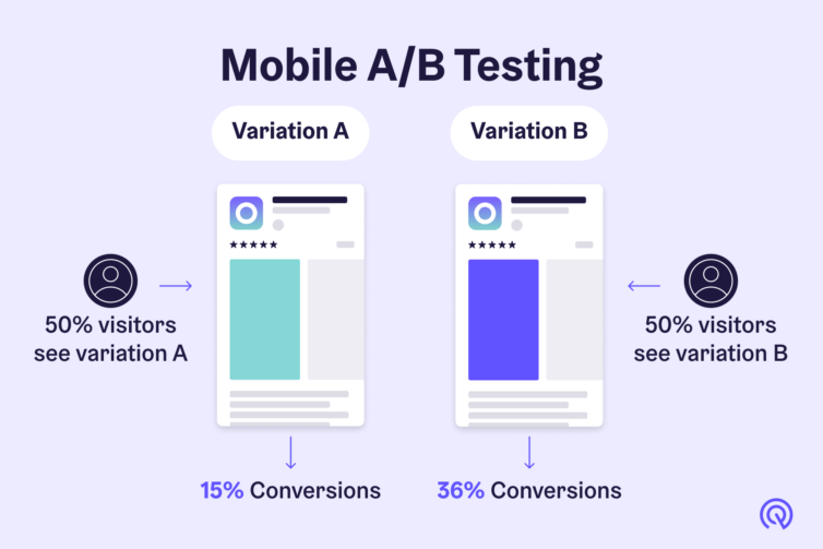
While surveys and interviews are cornerstones of user research, your toolbox doesn't stop there! Depending on your specific data visualization project, other user research methods can provide valuable insights:
- Usability Testing: This involves observing users as they interact with a prototype or existing data visualization. By observing their behavior and listening to their feedback, you can identify usability issues and refine your visualization for optimal user experience.
- A/B Testing: This method allows you to compare two versions of your data visualization to see which one is more effective in achieving your desired outcome (e.g., user understanding, engagement). This can be particularly useful when testing different design elements or layouts.
- Card Sorting: Present users with a set of cards containing data points or labels related to your visualization. Ask them to group the cards in a way that makes sense to them. This helps you understand how users categorize information and can inform the organization and labeling of your visualization.
Remember, the best user research approach often involves a combination of methods. Tailor your research strategy to the specific needs of your project and target audience.
User Personas for Design Thinking
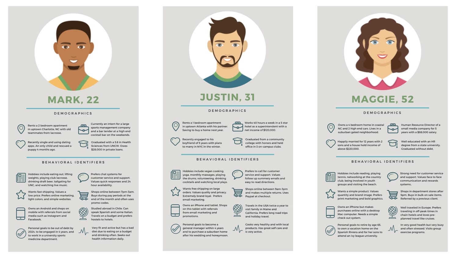
In design thinking, a user persona is a fictional character profile that represents a specific segment of your target audience. It's not a real person, but rather a composite based on user research data. The purpose of user personas is to:
- Build Empathy: By creating personas, you step outside your own perspective and imagine the world through the eyes of your users. This fosters empathy and helps you understand their needs, goals, and pain points.
- Focus Design Decisions: Personas act as a constant reference point throughout the design process. When making decisions about your data visualization, you can ask yourself, "Would this be clear and helpful for [persona name]?" This ensures your visualization is user-centered and addresses their specific needs.
- Improve Communication: Personas help you communicate design ideas and user needs to stakeholders in a clear and relatable way. Sharing persona profiles can create a shared understanding of the target audience and why design choices are being made.
Here's a breakdown of the key elements of a user persona:
- Demographics: Age, gender, profession, education level, etc.
- Goals: What information do they seek from data visualizations?
- Needs: What challenges do they face when interpreting data?
- Pain Points: What frustrations do they have with existing visualizations?
- Quote: A fictional quote that captures their thoughts or frustrations related to data.
By incorporating user personas into your design thinking process, you ensure your data visualization is not just aesthetically pleasing, but truly resonates with the people who will use it.
Persona Example
Here's a fictional example of a user persona tailored for a data visualization project to give you an idea:
Scenario: Designing a mobile app that displays public transportation usage data for a city.
User Persona:
- Name & Title: Maria Rodriguez, Urban Planner
- Demographics: 32 years old, lives in a major city, has a master's degree in urban planning.
- Goals: Identify areas with high public transportation ridership and low ridership to inform infrastructure development plans.
- Needs: Needs data visualizations that are clear, concise, and easily interpretable on a mobile device. Requires the ability to filter data by time of day, day of the week, and bus route.
- Pain Points: Frustrated with static reports that are difficult to navigate on a mobile device. Finds current data visualizations cluttered and hard to understand at a glance.
- Quote: "I need data visualizations that are like dashboards – I should be able to see the key information I need quickly and easily, so I can focus on making informed decisions about our city's transportation network."
Remember, this is just an example. The specifics of your user persona will depend on your chosen data visualization scenario and target audience.
Use this as a guide for your Persona assignment!
Empathy Mapping for Data Visualizations
Have you ever looked at a data visualization and thought, "This is beautiful, but I have no idea what it's trying to tell me"? Often, the gap lies in a lack of understanding of the user's perspective. This is where empathy mapping comes in!
Empathy Mapping: Stepping into Your Users' Shoes
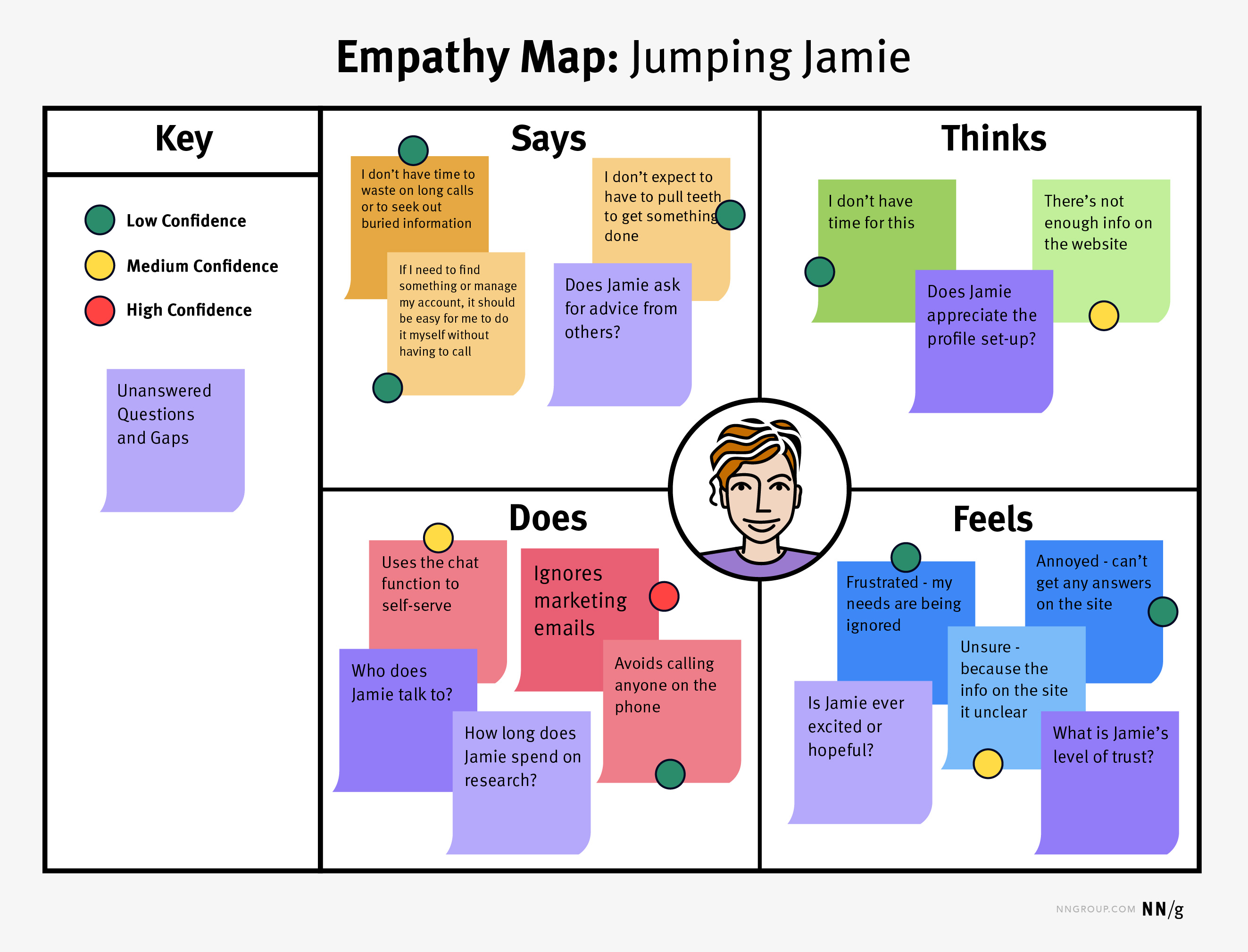
Think of empathy mapping as a visual brainstorming tool that helps you understand the world through your users' eyes. It's like creating a mind map, but specifically focused on capturing user emotions, thoughts, and experiences related to a particular topic (in this case, your data visualization project).
Why is Empathy Mapping Important for Data Visualization?
Data visualizations are all about communication. But if you don't understand how your audience feels, thinks, and interacts with data, your visualization might miss the mark. Empathy mapping bridges this gap by helping you:
- Uncover Hidden Emotions: By analyzing user emotions towards data visualization (frustration, confusion, excitement), you can identify potential roadblocks and design elements that evoke positive user experiences.
- Identify Pain Points: Understanding user pain points related to data visualizations (difficulty understanding charts, information overload) allows you to tailor your visualization to address those specific challenges.
- Design with User Needs in Mind: Empathy mapping helps you translate user thoughts and needs ("I need to see trends over time") into actionable design decisions for your data visualization.
The Four Quadrants of Empathy Mapping:
An empathy map typically consists of four quadrants, each focusing on a different aspect of the user experience:
- Says: Capture what users say verbally about data visualizations (e.g., "This chart is confusing," "I wish there was more data").
- Does: Observe and document user actions when interacting with data visualizations (e.g., zooming in on a specific section, ignoring certain elements).
- Thinks: Consider what users might be thinking as they interact with your visualization (e.g., "Is this data reliable?", "What does this trend mean for me?"). Here, user research comes in handy to infer these thoughts.
- Feels: Identify the emotions users might experience when encountering your data visualization (e.g., overwhelmed, frustrated, curious, engaged).
By populating these quadrants with user research findings, you can create a comprehensive picture of the user experience. This, in turn, guides you in designing data visualizations that resonate with your audience on an emotional and intellectual level.
Example Empathy Map: Public Transportation App Users

Scenario: We're designing a mobile app that displays public transportation usage data for a city, aimed at urban planners.
Says
- "This chart is too cluttered, I can't find the information I need."
- "I wish there was a way to compare ridership on different bus routes."
- "This data seems outdated, is there a way to see more recent information?"
- "Finally, an app that lets me see public transportation data on my phone!"
Does
- Zooms in on specific areas of the city on the map.
- Filters data by time of day and day of the week.
- Spends a lot of time hovering over data points to see detailed information.
- Switches between different data visualization formats (e.g., bar chart vs. heatmap).
Thinks
- "Is this data reliable? Where does it come from?"
- "What are the reasons behind these ridership patterns?"
- "How can I use this information to improve public transportation infrastructure?"
- "I wonder if there's a way to overlay this data with a map of planned construction projects."
Feels
- Frustrated when data is difficult to understand or outdated.
- Overwhelmed by too much information on the screen.
- Curious and excited to explore the data and its implications.
- Empowered to make data-driven decisions about city planning.
Insights:
This empathy map reveals that while urban planners are excited about the potential of the app, there are concerns about data clarity and accessibility. The design should focus on:
- Clear and concise data visualization: Prioritize user-friendly charts and minimize clutter.
- Data filtering and comparison options: Allow users to easily filter data by time, route, and other relevant criteria.
- Data transparency: Indicate data sources and update information regularly.
- Interactive features: Allow users to explore the data in different ways (e.g., zooming, filtering, overlaying data sets).
By addressing these user needs and emotions, the data visualization app can become a truly valuable tool for urban planners.
Building Empathy: User Research to Empathy Map
Let's walk through an example of how user research findings can be used to populate an empathy map and guide data visualization design decisions.
Scenario: We're designing a data visualization dashboard for a customer service team at an e-commerce company.
Step 1: Gather User Research Findings
Imagine we conducted surveys and interviews with customer service representatives. Here are some key findings:
- Surveys: Many users indicated frustration with current reports that are text-heavy and difficult to scan quickly. They also requested the ability to filter data by specific product categories and customer demographics.
- Interviews: During interviews, customer service representatives expressed feeling overwhelmed by the sheer volume of data they needed to process. They also highlighted the importance of being able to identify trends and patterns in customer inquiries to anticipate future issues.
Step 2: Populate the Empathy Map
Says:
- "These reports take too long to read, I need something quicker to understand."
- "I wish I could see data on specific product categories at a glance."
- "It would be helpful to know the demographics of customers who are contacting us most frequently."
Does:
- Spends a lot of time scrolling through lengthy reports.
- Frequently exports data to create their own charts in spreadsheets.
- Relies heavily on search functions within reports to find specific information.
Thinks:
- "Is there a way to see this data visually instead of just numbers?"
- "What are the underlying trends in customer inquiries? Are there any seasonal patterns?"
- "How can I use this data to improve the customer service experience?"
Feels:
- Frustrated with the time it takes to find the information they need.
- Overwhelmed by the amount of data they have to process.
- Curious about the reasons behind customer inquiries.
- Empowered to improve customer service with better data insights.
Step 3: Translate Insights into Design Decisions
By analyzing the empathy map, we can identify key user needs and translate them into design decisions for the data visualization dashboard:
- Prioritize visual elements: Move away from text-heavy reports and utilize charts, graphs, and other visual elements to present data in a clear and concise way.
- Enable filtering and segmentation: Allow customer service representatives to filter data by product category, customer demographics, or other relevant criteria. This empowers them to focus on specific areas of interest.
- Highlight trends and patterns: Design visualizations that make it easy to identify trends and patterns in customer inquiries. This could involve using line graphs or heatmaps to show changes over time.
- Interactive features: Consider incorporating interactive features that allow users to drill down into specific data points or compare different timeframes.
By addressing the user needs and emotions revealed in the empathy map, we can create a data visualization dashboard that is not only informative but also user-friendly and empowering for the customer service team.
This is just one example, and the specific insights you gain will depend on your target audience and research findings. However, the process of user research -> empathy mapping -> design decisions remains a powerful framework for creating data visualizations that resonate with your users.
Question 1:
Question 2:
Imagine you're tasked with redesigning the information boards at bus stops to display arrival times and route updates in a more user-friendly way.
Analyzing social media posts about public transportation experiences be a less effective method of gathering user research data for this project compared to conducting surveys with bus riders at various locations throughout the city. (True or False)
True
Question 3:
Question 4:
Your company is revamping the sales performance dashboards used by regional sales managers.
When conducting empathy mapping for this project, the least relevant quadrant is what sales managers say about the current dashboards.
False ✅
Question 5:
False ✅
End of Lesson Summary
Congratulations! You've embarked on a journey to unlock the secrets of user-centered data visualization. This module has equipped you with the essential tools to understand the "why" behind the "what" – the power of user research and empathy in creating visualizations that resonate with your target audience.
Key Takeaways:
- The Importance of User Research: We explored the critical role of user research in gathering data about your target audience's needs, goals, and challenges. Surveys, interviews, and other methods were discussed as ways to gain valuable insights.
- The Power of User Personas: We delved into the concept of user personas, fictional representations of your target audience. By crafting detailed personas, you can step into the shoes of your users and design data visualizations that truly meet their needs.
- Empathy Mapping for Deeper Understanding: The concept of empathy mapping was introduced as a tool to visualize user emotions, thoughts, and experiences related to data visualizations. We discussed how empathy mapping helps bridge the gap between data and human understanding.
- Translating Insights into Design Decisions: Finally, we learned how to translate user research findings and insights from empathy mapping into actionable design decisions for your data visualization project.
By applying these principles, you can transform data visualizations from mere charts and graphs into powerful communication tools that connect with your audience and leave a lasting impression.
Ready to put your newfound knowledge into action? Consider the following:
- Choose your data visualization scenario: Think of a real-world situation where you might need to create a data visualization. Who is your target audience?
- Conduct user research: Employ surveys, interviews, or other methods to gather data about your target audience's needs and challenges.
- Develop a user persona: Craft a detailed user persona that represents your target audience.
- Create an empathy map: Visualize user emotions, thoughts, and experiences related to data visualizations.
- Design with empathy in mind: Leverage your user research findings to make design decisions that ensure your data visualization is clear, concise, and user-friendly.
Remember, user research and empathy are ongoing processes. As you gather more data and refine your data visualization project, revisit your user research and personas to ensure you remain on the path to creating impactful and audience-centric visualizations.
Happy visualizing!

Comments
Post a Comment