Key Statistical Terms for Educational Research:
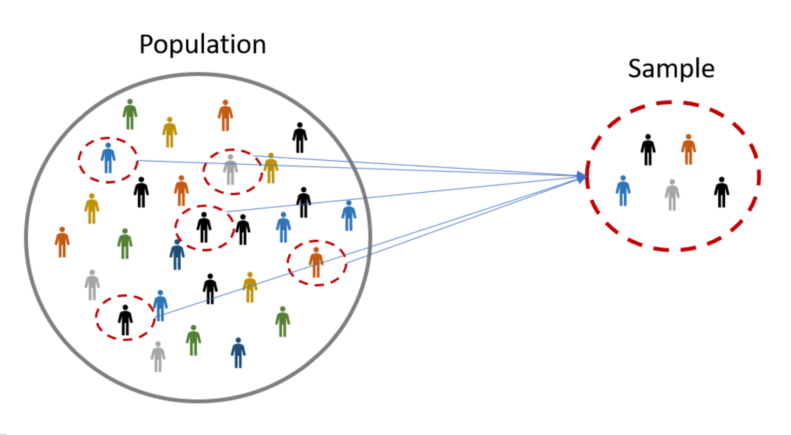
Understanding these fundamental statistical terms is crucial for interpreting data, designing research studies, and analyzing educational interventions. By knowing the type of data you're working with, you can choose the appropriate statistical methods and draw accurate conclusions from your research.
1. Population:
- Refers to the entire group of individuals or objects we are interested in studying. In education, it could be all students in a school district, all teachers using a specific curriculum, or all classrooms implementing a new teaching method.
2. Sample:
- A smaller subset of the population chosen for statistical analysis. Ideally, the sample should be representative of the entire population so that conclusions drawn from the sample can be generalized to the population as a whole.
3. Variable:
- Any characteristic or attribute of an individual or object that can vary and be measured. In education, examples of variables could be student achievement scores, teacher experience level, or classroom size.
4. Data Types:
Categorize the type of information a variable contains:
Nominal: Data consists of categories with no inherent order. Examples include hair color (blonde, brown, black), gender (male, female), or school type (public, private, charter).
Ordinal: Data has categories with a meaningful order. Examples include student grades (A, B, C), student satisfaction levels (very satisfied, somewhat satisfied, dissatisfied), or learning stages (emergent, developing, proficient).
Interval: Data has equal intervals between values and a true zero point. Examples include temperature, time, or student age. You can add or subtract units and interpret the differences meaningfully.
Ratio: Similar to interval data, but also has a meaningful zero point. This allows for ratios and proportions calculations (e.g., student height, test scores).
To create personalized learning plans for each student based on their unique needs.
Answer : To objectively analyze educational data and draw reliable conclusions about learning processes.
Measures of Central Tendency

Measures of central tendency are your statistical compass, pointing you towards the heart of your data set. They offer different ways to summarize the "typical" value within a group, giving you a quick snapshot of where most of your data points cluster. Let's dive into the three most common ones:
1. Mean: Imagine all your data points as a balancing act on a seesaw. The mean is the point where the seesaw would perfectly balance, with the sum of all values on either side being equal. It's often called the "average" and is calculated by summing up all values and dividing by the total number of data points.
Interpretation: The mean is a good all-around measure, but it can be sensitive to outliers (extreme values) that pull the seesaw towards one side. Think of a class where one student's score is significantly higher than everyone else's. The mean would be skewed towards that score and wouldn't accurately represent the typical student in the class.
2. Median: Picture your data points lined up in ascending order, like runners in a race. The median is the middle value – if you have an odd number of data points, it's the exact middle one. If you have an even number, it's the average of the two middle values.
Interpretation: The median is less affected by outliers than the mean. In our classroom example, the median would be closer to the score of the typical student, making it a more robust measure of central tendency when outliers are present.
3. Mode: Think of the most popular kid in school – the mode is the value that appears most frequently in your data set. It's like a fashion trend, showing which value everyone seems to be "wearing."
Interpretation: The mode can be useful for identifying the most common value, but it's not always a reliable measure of central tendency. If your data has multiple frequent values or a very spread-out distribution, the mode might not tell you much about the typical value.
Remember, each measure of central tendency has its strengths and weaknesses. Choosing the right one depends on the nature of your data and what you want to learn from it. By understanding how they work and interpreting them in context, you can gain valuable insights into the heart of your data set!
Which of the following is not a measure of central tendency?
Answer: range
Measures of Dispersion

Measures of dispersion, unlike their central tendency counterparts, tell you how spread out or variable your data is. They paint a picture of the "neighborhood" around the typical value revealed by measures of central tendency. Let's explore some common dispersion measures:
1. Range: It's the simplest, most straightforward measure. Imagine your data points all lined up like houses on a street – the range is simply the distance between the farthest houses, the highest and lowest values in your data set.
Interpretation: The range provides a quick sense of the overall spread but can be sensitive to outliers. If one house at the end of the street is vastly different from the others, the range would overestimate the typical spread.
2. Variance: Think of your data points as dancers performing a routine. Variance measures how far, on average, each dancer is from the center of the group (think mean or median). It's calculated by taking the squared deviations of each data point from the central tendency, averaging them, and then taking the square root.
Interpretation: Variance gives you a more nuanced picture of dispersion than range. It considers all data points and is not easily swayed by outliers (squared deviations dampen their impact). However, it's expressed in squared units, which can be difficult to interpret directly.
3. Standard deviation: This is the "friendlier" version of variance. It takes the square root of variance, transforming it back into the original units of your data. Think of it as the average distance of the dancers from the center, measured in the same units they "move" in.
Interpretation: Standard deviation is the most widely used measure of dispersion. It's easy to understand and interpret, as it tells you how much, on average, data points deviate from the central tendency. A low standard deviation means data points are clustered close together, while a high value indicates a more spread-out distribution.
Bonus: Other dispersion measures like interquartile range (IQR) and mean absolute deviation (MAD) offer alternative perspectives on data spread, focusing on specific segments of the distribution or using less complex calculations.
Choosing the right measure of dispersion depends on your data and research question. Experiment with different ones and see which best paints the picture you need! Remember, central tendency and dispersion work hand-in-hand to give you a complete understanding of your data landscape.
Parametric and Non Parametic Data
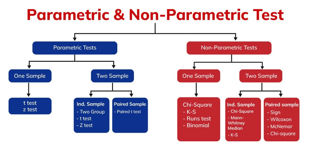
The world of statistics offers various tools, and choosing the right one depends on the nature of your data. Understanding the difference between parametric and non-parametric data is crucial for selecting the appropriate statistical test and drawing accurate conclusions from your research.
Parametric data:
- Assumptions: Holds strong assumptions about the underlying distribution of the data, often assumed to be normally distributed (bell-shaped curve).
- Characteristics: Usually interval or ratio data (data with equal intervals and a meaningful zero point, like temperature, height, or test scores).
- Examples: Analyzing student test scores across different teaching methods, comparing average income levels of two cities, or investigating the relationship between exercise frequency and weight loss.
- Statistical tests: Parametric tests like t-tests, ANOVA, and regression analysis are used. These tests rely on the assumptions about the data distribution and are generally considered more powerful when those assumptions hold true.
Non-parametric data:
- Assumptions: Makes fewer or no assumptions about the underlying data distribution. This makes them robust to various data shapes and less sensitive to outliers.
- Characteristics: Can be nominal, ordinal, interval, or ratio data.
- Examples: Comparing student satisfaction levels with a new curriculum (ordinal data), analyzing student responses to survey questions (nominal data), or investigating differences in exam pass rates between two universities (ratio data).
- Statistical tests: Non-parametric tests like Mann-Whitney U test, Kruskal-Wallis test, and chi-square tests are used. These tests are less powerful than parametric tests but are valuable when assumptions about the data distribution cannot be confirmed or are violated.
Key differences to remember:
- Assumptions: Parametric tests rely heavily on assumptions about the data distribution, whereas non-parametric tests make fewer or no assumptions.
- Data types: Parametric tests typically require interval or ratio data, while non-parametric tests can handle a wider range of data types.
- Power and robustness: Parametric tests can be more powerful when assumptions hold true, but non-parametric tests are more robust to violations of those assumptions and outliers.
- Choice of test: Choose the test that best aligns with the characteristics of your data and the research question you're trying to answer.
Remember: Always check the data distribution and consider the underlying assumptions before choosing a statistical test. If you're unsure, consulting a statistician or using software that recommends appropriate tests for your data can be helpful.
Data Visualizations
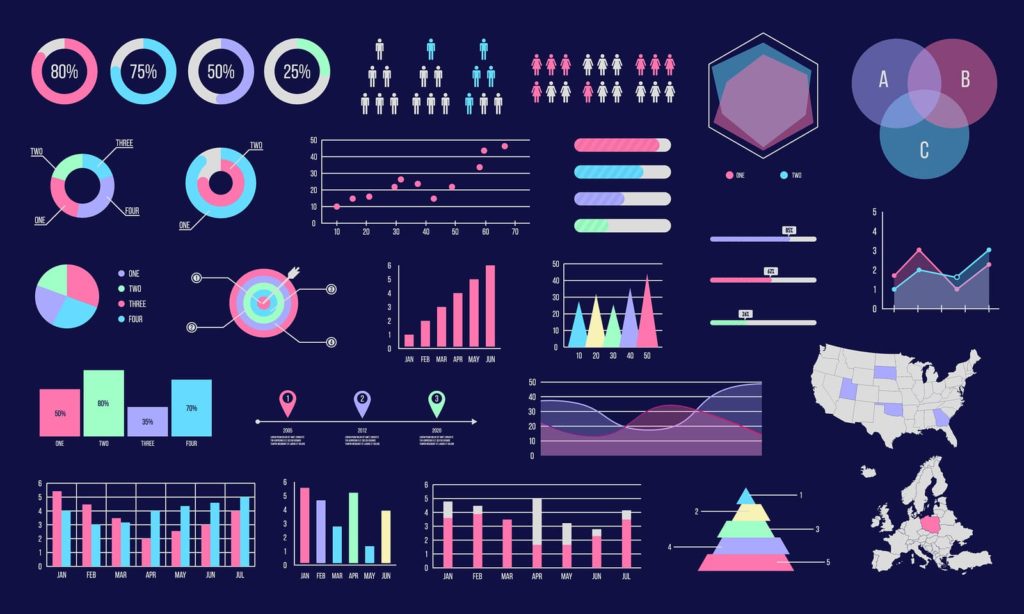
Data visualization is the unsung hero of statistics, transforming dry numbers into compelling stories that resonate with us. Just like a picture is worth a thousand words, a well-crafted visualization can unlock the insights hidden within your data and communicate them effectively to both experts and audiences unfamiliar with statistical jargon. Here's why data visualization is so important:
1. Clarity and Understanding:
- Data visualization cuts through the clutter of numbers and presents information in a visually appealing format. Our brains are naturally drawn to patterns and trends, and charts and graphs make these relationships readily apparent. Imagine trying to understand the distribution of student test scores by reading a long table of numbers versus seeing a histogram. Which one tells the story more clearly?
2. Identifying Patterns and Relationships:
- Visualization allows us to spot trends, outliers, and correlations that might be buried within the data. Scatterplots, for example, can reveal intricate relationships between variables, while boxplots can highlight differences between groups. By visually exploring the data, we can form hypotheses and guide our further analysis.
3. Enhanced Memory and Communication:
- We're much more likely to remember information presented visually than through dry text. Visualizations stick in our minds, making it easier to recall key findings and share them with others. Imagine giving a presentation – would a list of statistical results hold your audience's attention, or would a well-designed infographic leave a lasting impression?
4. Accessibility and Transparency:
- Data visualization makes statistical information accessible to a wider audience, even those who are not familiar with the intricacies of statistics. By using clear labels, annotations, and appropriate chart types, you can present complex findings in a way that everyone can understand. This transparency fosters trust and allows everyone to engage with the data-driven narrative.
5. Engagement and Storytelling:
- Visualizations can be powerful storytelling tools. By using engaging visuals and incorporating narrative elements, you can tell the story behind your data and draw your audience into the world of your research. This makes the results more impactful and relevant, encouraging people to think critically and connect with the findings on a deeper level.
Remember, data visualization is not just about making things pretty – it's about unlocking the full potential of your data and sharing its insights with the world. So, go forth and visualize! Your data will thank you.
Categorical Data
Let's explore how histograms, bar charts, and pie charts can be used to visualize and understand categorical data:
1. Histograms:
- What they are: Histograms are vertical bars depicting the frequency distribution of a categorical variable. Each bar represents a category (e.g., hair color), and the height of the bar corresponds to the number of observations (people) in that category.
- Example: Imagine you analyze the hair color of 100 students. Your histogram would have bars for blonde, brunette, black, etc., with the height of each bar showing how many students have that hair color.
- When to use: Histograms are ideal for visualizing the overall distribution of a categorical variable and identifying dominant categories or potential patterns (e.g., a bimodal distribution with peaks for blonde and brunette hair).
2. Bar Charts:
- What they are: Bar charts use horizontal or vertical bars to compare the frequency or percentage of different categories within a variable. Each bar represents a category, and its length or height corresponds to the proportion of observations falling into that category.
- Example: You could use a bar chart to compare the frequency of different grade levels (e.g., freshman, sophomore) in your college statistics class.
- When to use: Bar charts are effective for comparing the magnitude of different categories within a single variable, allowing for quick visual comparisons between groups.
3. Pie Charts:
- What they are: Pie charts are circular graphs divided into slices, where each slice represents a category within a variable and its area corresponds to the proportion of observations in that category.
- Example: You could use a pie chart to visualize the types of pets students in your class own (dogs, cats, fish, etc.), with each slice showing the percentage of students with each type of pet.
- When to use: Pie charts are good for showcasing the relative contributions of different categories within a single variable, particularly when there are a limited number of categories. However, be cautious of using pie charts for data with many categories, as it can become visually cluttered and difficult to interpret.
Remember:
- Choose the appropriate visualization tool based on the nature of your data and the research question you're trying to answer.
- Label your axes and slices clearly, and provide informative titles for your visualizations.
- Consider additional data points like standard deviation or error bars to add depth to your insights.
A histogram is best suited for representing:
Answer: interval data
Scatterplots
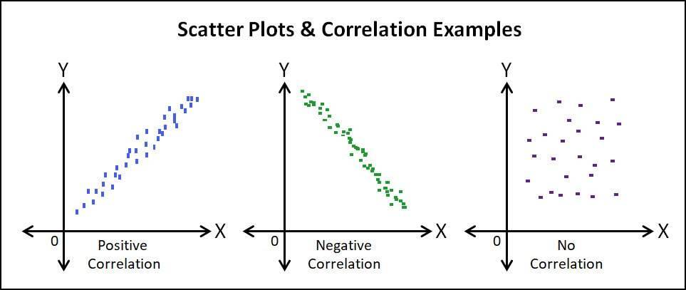
Scatterplots are the superheroes of data visualization when it comes to exploring relationships between two variables. They let you see how one variable "dances" with another, revealing patterns, trends, and hidden connections that numbers alone might struggle to convey. Here's how they work:
Imagine a dance floor:
- Each data point on the scatterplot is like a dancing couple. One coordinate determines their position on the X-axis (think left-right movement), and the other one their position on the Y-axis (think up-down movement).
- The type of dance they perform reveals the relationship between the variables:
- Waltz: If the points form a clear upward or downward diagonal line, there's a positive correlation, meaning as one variable increases, the other one tends to increase as well (e.g., study hours - exam score).
- Tango: If the points form a diagonal line from top left to bottom right, there's a negative correlation, meaning as one variable increases, the other one tends to decrease (e.g., exercise frequency - weight).
- Cha-cha: If the points are scattered randomly without a clear pattern, there's no significant correlation, meaning the changes in one variable don't seem to predict changes in the other (e.g., shoe size - favorite color).
Beyond the basic steps:
- Clusters and Outliers: Scatterplots also reveal clusters of points, suggesting possible subgroups within the data. They can also highlight outliers, data points that stand far away from the main dance floor, potentially indicating unusual cases or errors.
- Strength of the Relationship: The tightness of the point cluster around the trend line tells you about the strength of the correlation. A tight cluster indicates a strong relationship, while a loose cluster signifies a weaker one.
Why scatterplots are awesome:
- Visual storytelling: They bring your data to life, making it easier to identify patterns and trends than sifting through numbers.
- Flexibility: They work with a wide range of data types, from numeric to categorical.
- Intuitive understanding: Even without deep statistical knowledge, you can grasp the general relationship between variables through the visual dance floor analogy.
Remember:
- Scatterplots are a starting point, not the end of the story. Further analysis with statistical tests is needed to confirm the observed relationships and draw conclusions.
- Consider data cleaning and transformations to ensure your scatterplot truly reflects the underlying relationship.
- Label your axes clearly and add additional information like trend lines or annotations to enhance understanding.
By mastering the art of interpreting scatterplots, you'll unlock a powerful tool for uncovering hidden connections within your data and gain valuable insights for your research or any data-driven exploration you embark on.
Boxplots
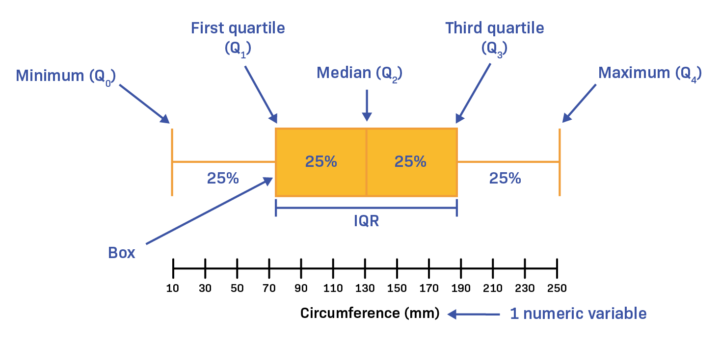
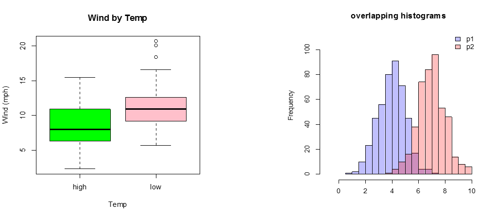
Boxplots, also known as box-and-whisker plots, are versatile tools in the data visualization toolbox. They offer a quick and informative snapshot of the distribution of your data while highlighting potential outliers. Imagine them as detectives, scrutinizing your data for patterns and anomalies.
The Anatomy of a Boxplot:
- The Box:
- Represents the middle 50% of your data. Its lower edge marks the first quartile (Q1), which means 25% of the data points are below it. The upper edge marks the third quartile (Q3), meaning 75% of the data points are below it.
- The line within the box shows the median (Q2), which is the middle value when your data is arranged in ascending order.
- The Whiskers:
- Extend from the box and represent the remaining 25% of the data.
- The ends of the whiskers typically mark the 1.5 times interquartile range (IQR) away from the Q1 and Q3, respectively. IQR is the difference between Q3 and Q1. Any data points beyond these whiskers are considered outliers.
Identifying Outliers:
- Points fall outside the whiskers, indicating values significantly different from the majority of the data. Outliers can skew your analysis, so boxplots help you identify them for further investigation.
Understanding Data Distribution:
- The box's shape and position reveal valuable information about your data:
- Symmetrical box: Lengths of the upper and lower whiskers are similar, suggesting a normal distribution.
- Skewed box: One whisker is longer than the other, indicating a skewed distribution (left-skewed if upper whisker is longer, right-skewed if lower whisker is longer).
- Outliers: Presence of outliers can distort the box shape and suggest non-normality.
Boxplots vs. Histograms:
- Boxplots offer a more concise overview of the data's central tendency, spread, and potential outliers.
- Histograms give a detailed picture of the frequency distribution, but identifying outliers and skewness can be less straightforward.
Remember:
- Boxplots are descriptive tools, not inferential tests. They don't tell you about the significance of observed trends or differences between groups.
- Consider using boxplots alongside other visualizations like histograms or scatterplots for a more comprehensive understanding of your data.
Tools and Resources for Data Visualizations
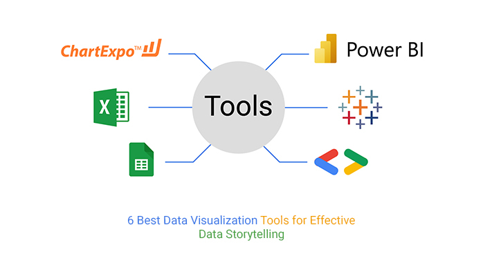
There are plenty of fantastic tools and resources out there to help you transform your data into compelling visualizations. Let's explore some options for both software and online tools:
Software:
- Statistical Packages:
- SPSS: A powerful and comprehensive statistical software package with rich data analysis and visualization capabilities. Great for advanced users, but can have a steeper learning curve.
- R: A free and open-source language widely used for statistical analysis and data visualization. Offers immense flexibility and customization, but requires programming knowledge.
- SAS: Another comprehensive statistical software with advanced analytics and visualization features. Often used in business and academic research.
- Graphic Design and Visualization Tools:
- Adobe Illustrator and Photoshop: Industry-standard tools for creating professional-grade graphics and visualizations. Provide great detail and customization, but may require design skills.
- Tableau: A powerful software specifically designed for data visualization. Offers intuitive drag-and-drop interface, interactive features, and beautiful templates.
- Power BI: Another popular tool from Microsoft, especially good for business intelligence and dashboard creation. Integrates seamlessly with other Microsoft products.
Online Tools:
- Free Visualization Tools:
- Google Data Studio: A free tool from Google with easy-to-use templates and dashboards. Integrates seamlessly with Google Sheets and other Google products.
- Datawrapper: A user-friendly online tool for creating interactive charts and graphs. Offers various formats and good accessibility features.
- Chartblocks: A free tool with a focus on interactive and animated charts. Great for engaging presentations and reports.
- Paid Visualization Tools:
- Infogram: An online platform for creating infographics and other data visualizations. Offers a wide range of templates, icons, and interactive features.
- Looker: A cloud-based business intelligence platform with powerful data visualization capabilities. Great for large datasets and complex dashboards.
- Sisense: Another popular business intelligence platform with a user-friendly interface and focus on interactive visualizations.
Additional Resources:
- Data Viz Community: Online communities like "r/dataisbeautiful" and "Tableau Public" offer inspiration, tutorials, and feedback on your data visualizations.
- Online Courses: Platforms like Coursera and Udemy offer various courses on data visualization and specific software tools.
- Interactive Examples: Websites like "Storytelling with Data" and "FlowingData" showcase inspiring examples of data visualization in action.
Remember:
- Consider your needs and the type of data you're working with when choosing a tool.
- Start with simpler tools and progress to more advanced ones as your skills grow.
- Don't get caught up in the bells and whistles – focus on telling a clear and informative story with your data.
Demystifying Statistical Hypothesis Testing: A Guide for Inquisitive Minds
:max_bytes(150000):strip_icc()/null-hypothesis-vs-alternative-hypothesis-3126413-v31-5b69a6a246e0fb0025549966.png)
Statistical hypothesis testing lies at the heart of scientific inquiry, allowing us to move beyond mere observations and draw inferences about populations based on samples. It's a thrilling intellectual dance between skepticism and possibility, where we challenge established notions and seek evidence to support alternative explanations.
The Grand Duel: Null vs. Alternative Hypotheses
Every hypothesis test begins with a duel. In one corner stands the null hypothesis (H0), the conservative claim that there is no real difference or relationship between the groups or variables being studied. This is the reigning champion, presumed true until strong evidence emerges to dethrone it.
In the other corner stands the alternative hypothesis (Ha), the challenger, proposing a specific claim about a difference or relationship that could potentially overthrow H0. This challenger could take various forms, such as asserting a difference in means, correlations, or proportions between groups.
Choosing the Right Weapon: Selecting Statistical Tests
Like knights of science, we choose our weapons wisely. The nature of our data and research question dictate the appropriate statistical test. For example, if we have normally distributed data and want to compare the means of two groups, a t-test might be the champion's choice. But if our data isn't normally distributed, a non-parametric test like the Mann-Whitney U test might be a more suitable challenger.
Decoding the Verdict: P-Values, Confidence Intervals, and Effect Sizes
The test results arrive, and the tension thickens. The p-value is the key piece of evidence, the probability of observing the data (or more extreme data) if the null hypothesis were true. A low p-value (typically below 0.05) suggests enough evidence to dethrone H0 and support Ha. But remember, a low p-value doesn't prove Ha – it just weakens the champion's reign.
Confidence intervals provide another perspective, offering a range of plausible values for the population parameter we're interested in. A narrow interval suggests greater certainty, while a wider one indicates more uncertainty.
Effect size tells us the magnitude of the observed difference or relationship. It gives us a sense of how meaningful the results are, even if they are statistically significant.
Beware the Dragons: Limitations and Misinterpretations
Statistical tests are powerful tools, but they are not without limitations. They make assumptions about the data and randomness, and violating these assumptions can lead to misinterpretations. Additionally, p-values alone shouldn't dictate conclusions – context, effect size, and research design all play crucial roles.
Concluding the Inquiry: A Journey of Insight
Successfully navigating the labyrinth of statistical hypothesis testing requires meticulous planning, thoughtful interpretation, and a healthy dose of skepticism. But when used wisely, these tests can transform data into compelling stories, paving the way for deeper understanding and evidence-based decisions. So, embrace the intellectual challenge, choose your weapons wisely, and embark on a journey of scientific inquiry where every test result is a step closer to revealing the fascinating secrets hidden within your data.
Remember, statistical hypothesis testing is not a black box. By understanding the key concepts, choosing the right tools, and interpreting the results thoughtfully, you can transform yourself from a data spectator to a skilled analyst, weaving stories from the fabric of numbers.
A statistically significant result always means the effect size is large.
Answer: false
Real-World Statistics in Educational Research
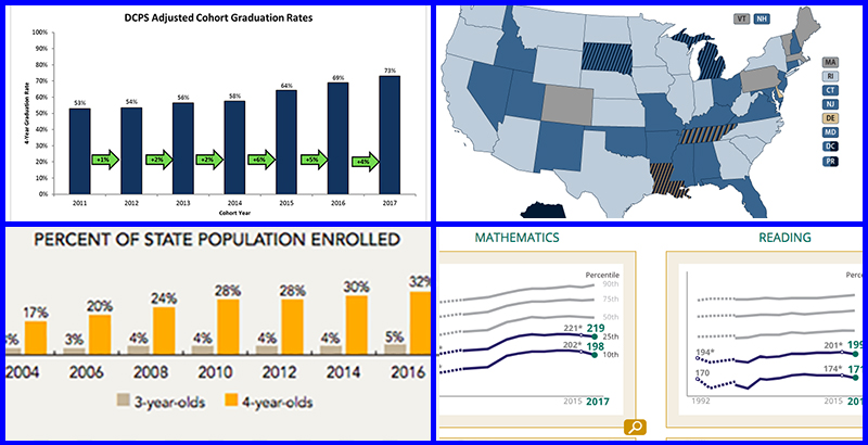
Statistics isn't just a jumble of equations; it's a powerful tool for educators to understand the complex world of learning. Let's dive deeper into how educational research embraces statistics to improve teaching, enhance student outcomes, and ultimately, build better learning environments.
Case Studies: Unraveling the Threads of Achievement with Statistics
1. Cracking the Code of Reading Fluency: Imagine a researcher analyzing standardized reading tests from hundreds of elementary school students. They use t-tests to compare the average fluency scores of students who participated in a new interactive reading program compared to those who used traditional methods. A statistically significant difference in favor of the new program highlights its potential effectiveness.
2. Mapping the Maze of Math Motivation: A study might explore factors influencing middle schoolers' motivation in math. Researchers employ regression analysis to examine how variables like teacher-student interaction, homework workload, and learning style relate to self-reported motivation scores. Identifying significant relationships can guide interventions to boost engagement.
3. Decoding the Dance of Collaboration: A study aims to understand the impact of collaborative learning in science classrooms. Researchers might use ANOVA to compare the average test scores of students who worked in small groups versus those who learned individually. Finding no significant difference could prompt further investigation into the specific methods and dynamics of group work needed for effective collaboration.
The Ethical Tightrope: Balancing Information and Integrity
While statistics is a powerful tool, it's crucial to consider its ethical implications in educational research:
- Informed Consent: Students and parents should understand how their data will be used and have the right to opt out.
- Confidentiality and Anonymity: Data should be anonymized to protect individual privacy and prevent bias.
- Validity and Reliability: Research methods and data analysis should be rigorous and transparent to ensure accurate and unbiased results.
- Responsible Interpretation: Conclusions should be grounded in statistical evidence and avoid overgeneralization or misrepresentation.
From Numbers to Decisions: Building an Evidence-Based Future
Statistical knowledge empowers educators to move beyond intuition and anecdotal evidence. By harnessing data, they can:
- Develop Research Questions: Statistical concepts like variability and relationships guide the formulation of specific, measurable questions that research can address.
- Design Effective Studies: Choosing the right statistical methods allows for robust data collection and analysis, ensuring reliable and relevant results.
- Interpret Findings with Nuance: Understanding statistical tests and p-values enables educators to avoid simplistic interpretations and consider factors like effect size and context.
- Make Data-Driven Decisions: Evidence-based practices informed by statistical analysis can guide curriculum development, teaching strategies, and resource allocation for better learning outcomes.
Randomly assigning participants to groups is crucial for minimizing bias in an experiment.
Answer: True
Lesson Review
Congratulations on completing your self-paced journey into the fascinating world of statistics in education research! By now, you've equipped yourself with valuable tools and insights to unlock the stories hidden within your data and make evidence-based decisions that will impact learning. Let's recap the key takeaways:
1. Demystifying the Statistical Landscape:
- We explored the fundamental concepts of descriptive statistics (central tendency, dispersion) and inferential statistics (hypothesis testing, p-values, confidence intervals).
- You learned how to choose appropriate statistical tests based on your research question and data type (parametric vs. non-parametric).
2. Real-World Applications:
- We delved into case studies showcasing how researchers use statistics to analyze student achievement, learning outcomes, and factors influencing motivation and collaboration.
- You've seen how statistical knowledge empowers educators to develop research questions, design effective studies, and make data-driven decisions for better learning outcomes.
3. Ethical Considerations:
- We emphasized the importance of ethical data collection and analysis in educational research, focusing on informed consent, confidentiality, and responsible interpretation of results.
4. Expanding Your Skillset:
- You've been introduced to various resources (software, online tools, data visualization) to further explore and refine your statistical skills.
Now, it's time to test your knowledge and solidify your understanding:
- Challenge yourself: Answer practice questions related to statistical concepts and data analysis.
- Explore further: Research real-world examples of statistics in education research that pique your interest.
- Connect the dots: Think about how you can apply these statistical tools to your own research or educational practice.
Remember, statistics is a journey, not a destination. Continue honing your skills, delve deeper into specific areas, and most importantly, use your newfound knowledge to become an agent of positive change in the world of education.
Please complete the forum discussion and assignment by the module deadline.
Congratulations - end of lesson reached
Your current grade is 10.0 out of 10

Comments
Post a Comment